
Brand Guide / Point
2.1 Logo
Our uniquely ownable brand symbolOverview
Primary logo
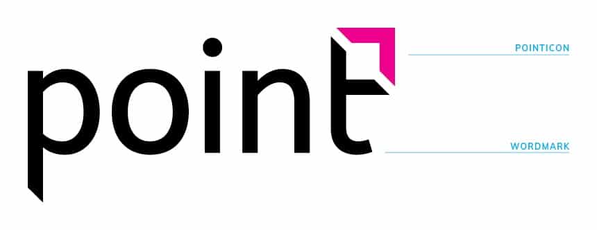
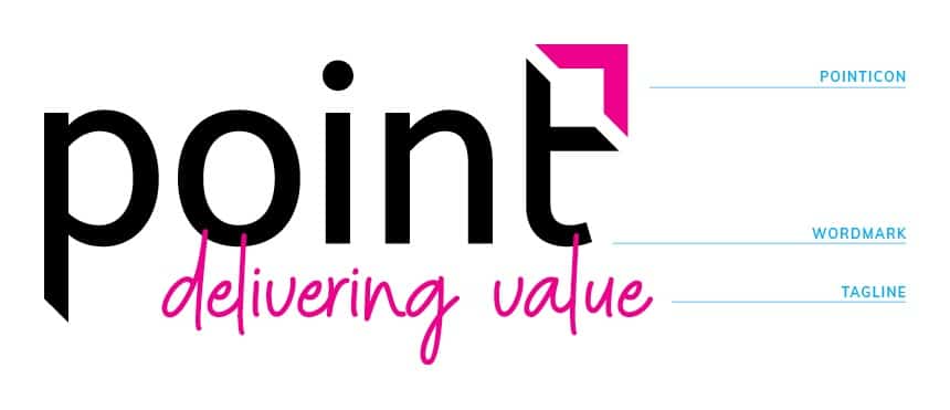
Our logo consists of 2 permanent elements, the wordmark and the icon that we fondly call our ‘pointicon’. The tagline ‘Delivering Value’ is a semi-permanent element as it can be omitted in certain scenarios. The ‘pointicon’ is our guiding ‘compass point’ that directs us towards the values we strive for – integrity, innovation and partnership – and is an integral part of our identity.
The overall philosophy is, we are Point. Full stop. That is who we are. There is no need to differentiate geographically, so no country or city names are required as a descriptor. We do not need internal differentiation (TEAMS). If this is a requirement it will be treated differently (graphically).
Click on the image to download logo files
Logo iterations
It is necessary to have the logo and ‘pointicon’ in various colour variations when applying the logo onto backgrounds (colour or image). This helps ensure the legibility of the logo and that it does not disappear on a layout. Additionally, certain printing methods such as screen printing, laser engraving etc require a one colour logo. Depending on the method of production or printing specifications the one colour white or one colour black logos can be supplied.
These are the only approved variations for our logo and ‘pointicon’.
Click on the image to download file/s

Minimum size
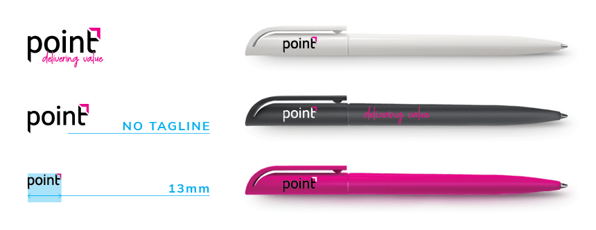
In order to maintain the integrity of our brand, a minimum size has been established to ensure our logo and tagline are always legible, especially when reducing them down in size. Discretion must be used when applying the logo at a significantly reduced size. If you are not sure please contact the Marketing Department for guidance.
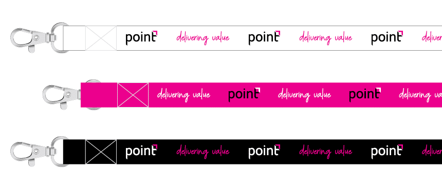
When the logo needs to be used at a very small size for example on a pen, the tagline must be removed and only the logo used. ‘Delivering Value’ can be used separately from the Point logo.
Clear space
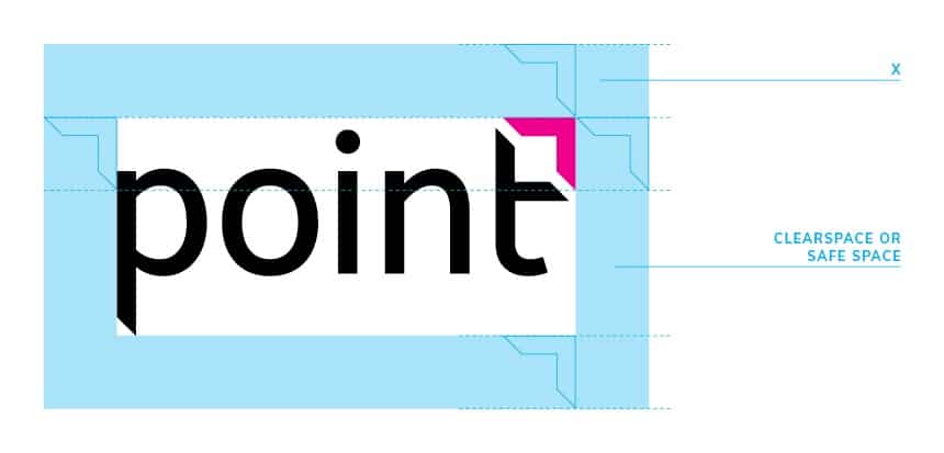
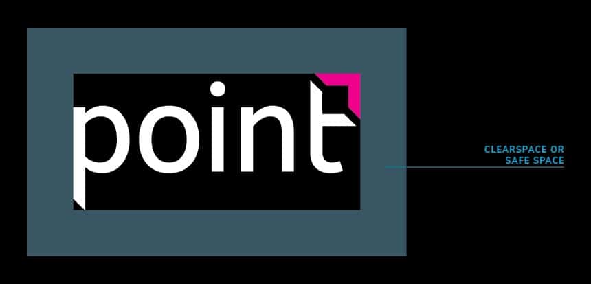
The unit of measure ‘X’ is determined by the height and width of the ‘pointicon’. This is used when measuring and placing elements in proximity to one another.
The area determined by ‘X’ surrounding our logo is called the clear space or an ‘area of isolation’, which provides an exclusion area within which no other typographic, graphic, photographic element, text or headline may be placed. Exceptions to this rule may occur in certain applications such as event and branding applications where size restrictions, shape and other factors influence the placement and application of the logo (This is, of course, the exception, not the rule).
Logo misuse
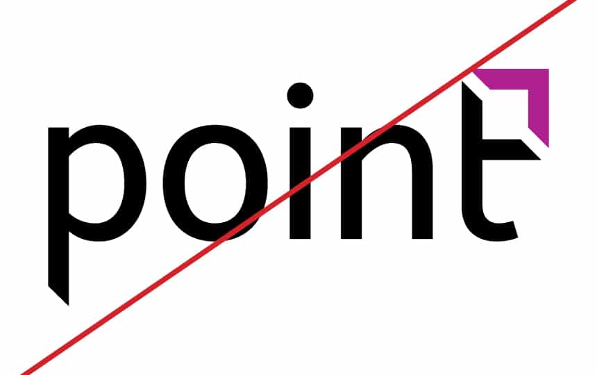
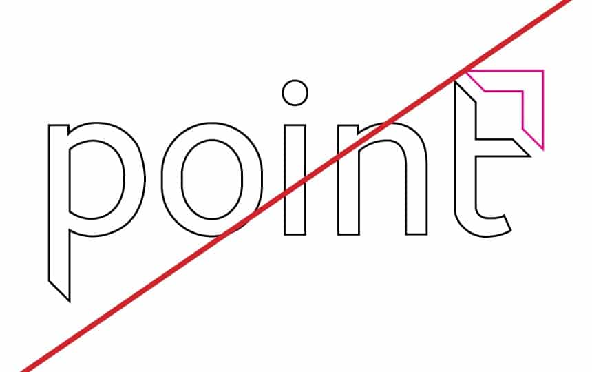
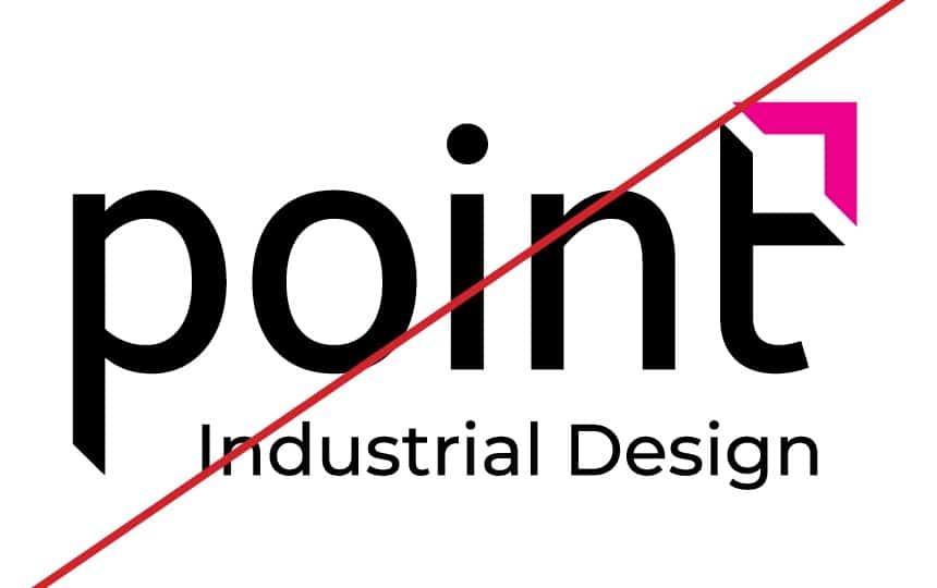
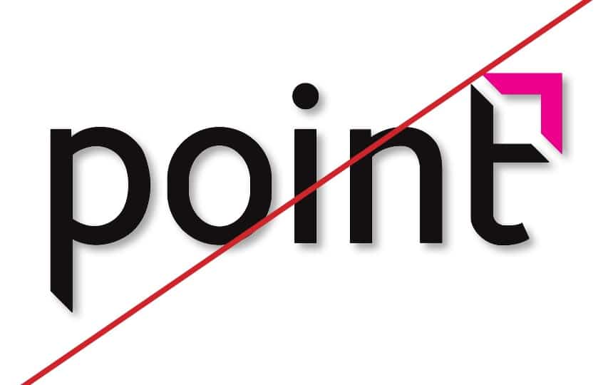
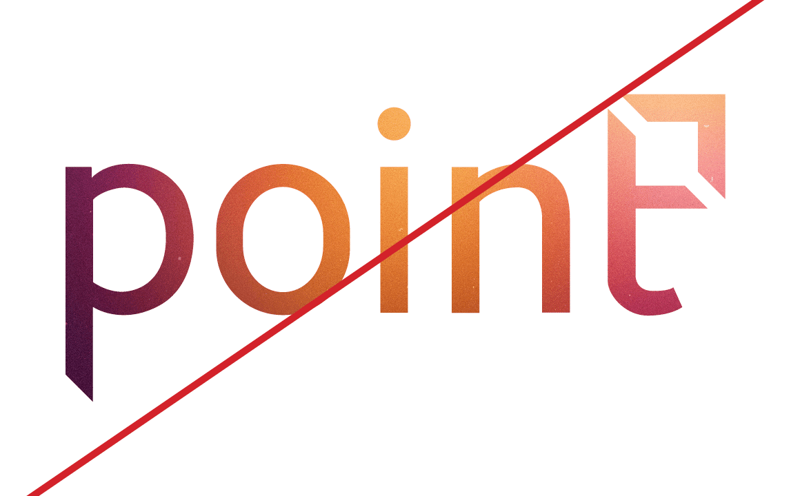
Shown here are common mistakes that should be avoided when working with and applying our logo. Doing any of these adjustments, effects or changes will result in the degradation and dilution of our brand and identity. We want to avoid this at all costs. It is important to retain the integrity of our brand assets and most importantly our logo.

'Delivering Value' tagline
A tagline fulfills a very important purpose, it sums up our mission, vision and culture in one clear statement. Applied across the entire business, it captures the overall benefit whether it be a product, service, department or idea. It is memorable, succinct and emotive.
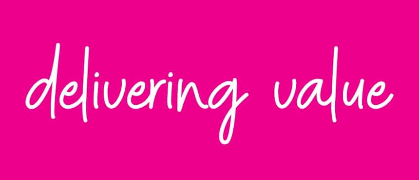
Our tagline ‘delivering value’ is our promise to clients and suppliers. It is what we do. At every touchpoint and interaction with our clients and their brands, we deliver value, through innovation, thought-leadership, cost savings, ease of production and so much more. Aligning the brand to the value-added offering of the business means that everything we do is about delivering value to and for clients. Deliberately set in a handwritten font, it helps to bring across the emotive side of our brand offering.
Do NOT use another font, handwritten or not.
Do NOT alter the size or colour relationships.
'Your marketing services partner' descriptor
‘Your marketing services partner’ is a descriptor we use on marketing collateral that reminds our clients who we are to them. It reinforces our tagline, qualifying that we deliver value through being their marketing services partner.
‘Your marketing services partner’ has been created as VECTOR artwork and should not be recreated. It uses our brand font, Montserrat and is always displayed in sentence case. It may NEVER sit with the logo as a descriptor.


