Brand Guide / Point
2.2 Icon
The symbol that embodies our entire brandOverview
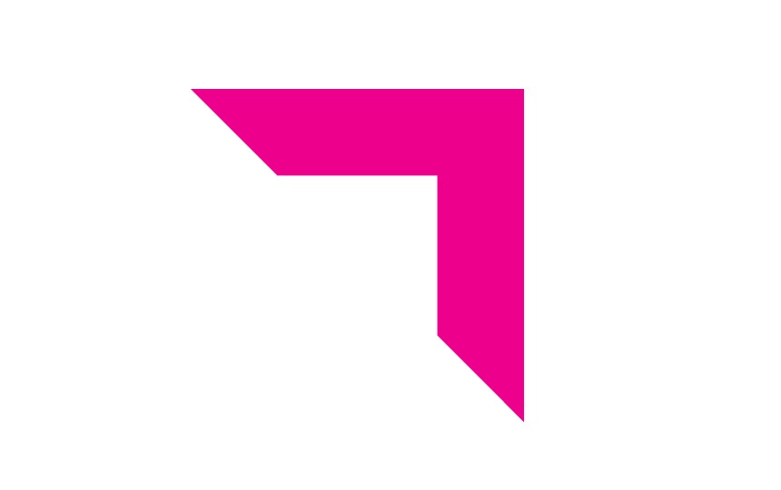
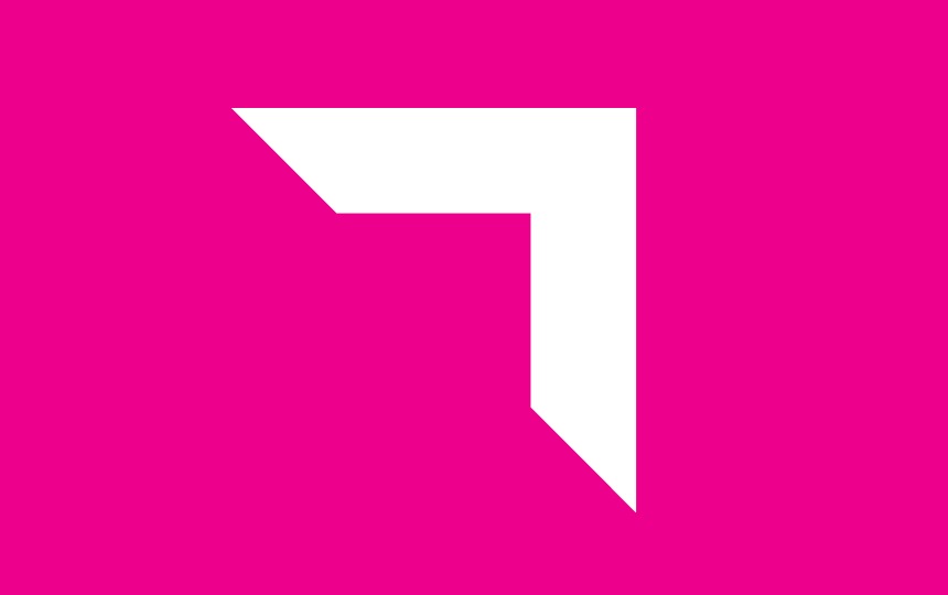
'Pointicon'
‘Pointicon’: Poi-nti-con (poi-n’ti-kon’)
noun – A magenta corner square icon that characterises the legendary Point brand.
The Point icon – ‘Pointicon’ – will become our Nike ‘tick’, the singularly identifiable graphic element that when seen by our clients and staff puts our brand top-of-mind and instill a sense of trustworthiness.
It is our guiding ‘compass point’ that directs us towards the values we strive for – integrity, innovation and partnership. It must be used whenever and wherever possible.

Placement
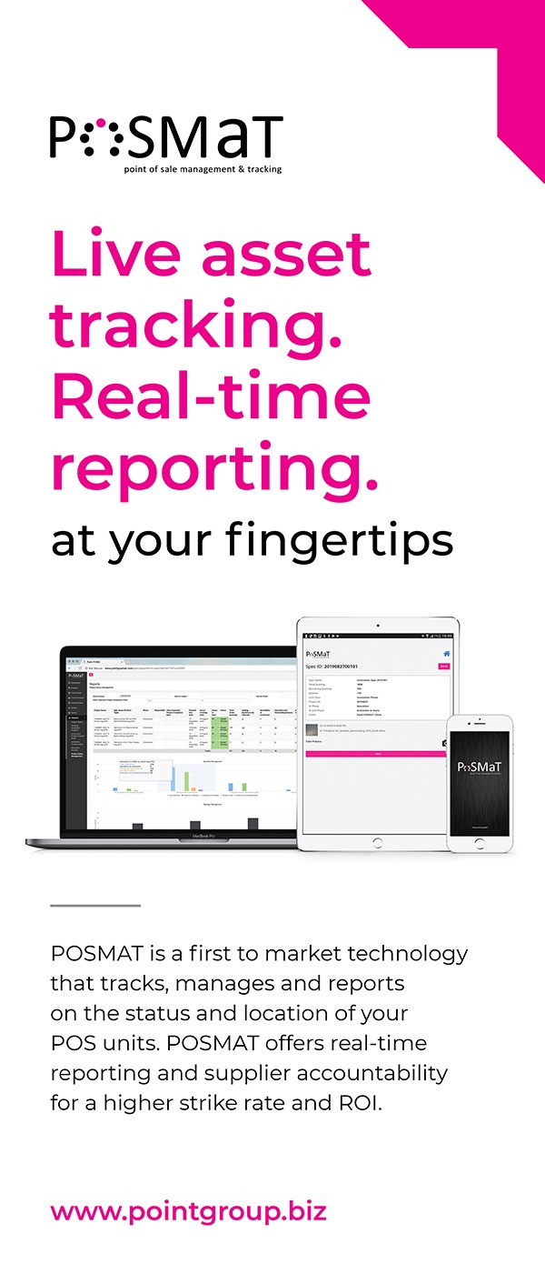
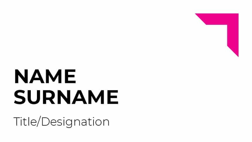
The ‘Pointicon’ can be applied in different ways, namely as part of the point logo, as a standalone device or as part of a pattern graphic. When using the ‘Pointicon’ on its own on a layout it can be placed anchored to the top right corner of a page/layout or with a slight margin on the top and on the right.
Regardless of where it is placed or how it is used, it is important to retain the integrity of our core brand assets, and the ‘Pointicon’ is never to be used in a way that would dilute or detract from our brand.
'Pointicon' used in patterns
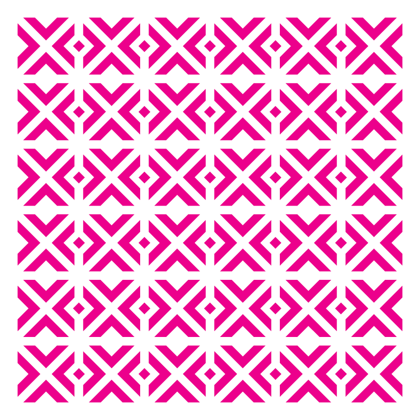
The ‘Pointicon’ is a very versatile graphic element and can be used creatively in a variety of combinations and sizes in order to create patterns. These patterns are used as part of our corporate identity/visual language to create interest and further reinforce the value of little Magenta arrow that guides our way.
The patterns must be made up of ‘pointicons’ in a variety of directions and orientations. They can be used in any colour combination (magenta, black and white). They can be used in blocks, as ‘wallpaper’ or strips depending on the requirements and application.