
Brand Guide / Point
2.3 Colours
Understanding our colour philosophyOverview
Primary colour palette
Our primary colours have been chosen to reinforce our image and identity. As an intrinsic part of our brand their consistent and effective application is vital. Our colours must be used with confidence and in a way that reinforces our brand visual language. When people see our colours they should immediately be reminded of our brand, what it stands for and the value we add.
DO NOT substitute colours for ones that appear similar.
DO NOT add colours for differentiation or variety.

Magenta
CMYK
0 / 100 / 0 / 0
Pantone®
Process Magenta
RGB
236 / 0 / 140
HEX
#ec008c

Black
CMYK
0 / 0 / 0 / 100
Pantone®
Black
RGB
0 / 0 / 0
HEX
#000000
PANTONE™ colours are for SPOT printing, CMYK is used for full colour/4 colour process printing, RGB is for digital and Hexadecimal (#) is for web/online. Colours, when printed, may differ and can and will be affected by factors such as: humidity, print process – litho vs digital, paper stock, finishes – UV varnish etc. Note: Spot UV varnishing over a colour may result in the colour/s becoming darker. Where type is reversed out of a colour, a heavier/thicker variant may be required to ensure legibility. The colours shown have not been evaluated by PANTONE™ Inc. for accuracy and may not match the PANTONE™ Colour Standards. Consult current PANTONE™ publications for accurate colour. Colour values may not display accurately due to monitor calibration and will not be consistent across different screens/monitors.
Secondary colour palette
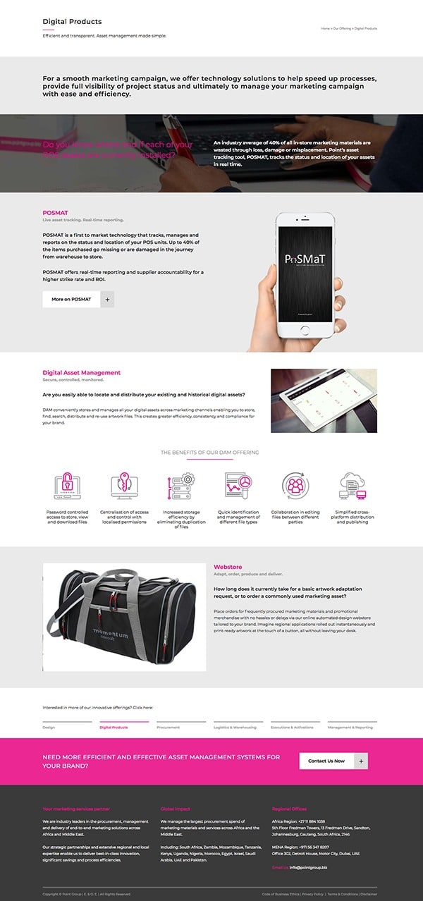
Our secondary colour palette is very subtle and used typically for differentiation of content areas, for example on our website where we have rows of information and content that needs to be ‘separated’. The colours range from a dark to a very light grey. They can be used to detail areas of content or create a visual hierarchy on a layout.
They can also be used for headings and text on our website where it is necessary for it to be ‘toned’ down (i.e. not black in colour)
DO NOT substitute colours for ones that appear similar.
DO NOT add colours for differentiation or variety.

90% Black
CMYK
0 / 0 / 0 / 90
Pantone®
–
RGB
67 / 67 / 67
HEX
#434343

50% Black
CMYK
0 / 0 / 0 / 50
Pantone®
–
RGB
148 / 149 / 153
HEX
#949599

5% Black
CMYK
0 / 0 / 0 / 5
Pantone®
–
RGB
241 / 243 / 242
HEX
#eaeaea

70% Black
CMYK
0 / 0 / 0 / 70
Pantone®
–
RGB
109 / 110 / 114
HEX
#6D6E72

15% Black
CMYK
0 / 0 / 0 / 15
Pantone®
–
RGB
220 / 221 / 223
HEX
#DCDDDF
Accent colours
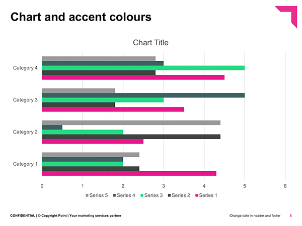
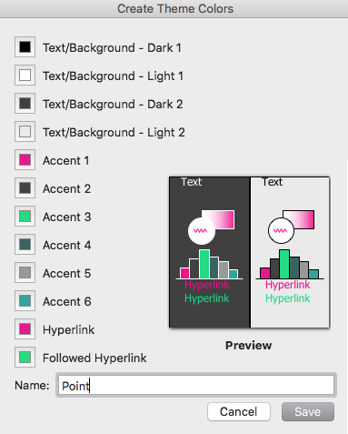
These accent colours have been selected to compliment and support our primary colours. Accent colours are only used in PowerPoint templates where graphs, pies and tables require an extended palette in order to display the data accurately.
Accent colours 3 – 6 are NOT to be used in print material or any other form of communications such as emailers, banners or clothing. They are solely for use in PowerPoint presentation graphs and pies etc and have been pre-set in our ppt templates.
DO NOT substitute colours for ones that appear similar.
DO NOT add colours for differentiation or variety.
Accent 1
CMYK
–
Pantone®
–
RGB
–
HEX
#ec008c

Accent 3
CMYK
–
Pantone®
–
RGB
–
HEX
#00dd7f

Accent 5
CMYK
–
Pantone®
–
RGB
–
HEX
#999999
Accent 2
CMYK
–
Pantone®
–
RGB
–
HEX
#424242

Accent 4
CMYK
–
Pantone®
–
RGB
–
HEX
#3b6162

Accent 6
CMYK
–
Pantone®
–
RGB
–
HEX
#2ba49d