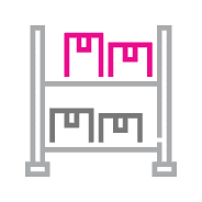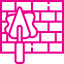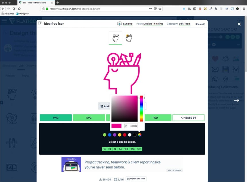
Our icon style is linear and consists of straight edges and sharp points (i.e. not rounded) This is intentional as it mimics the strength and solidity of our ‘pointicon’ and is intended to complement our overall identity. The clean, simple icon style is clearly identifiable.
Icons are used as elements that support the context of the brand message. They can simplify and deliver a message, concept or idea in a very succinct way.